A structured approach to redesign
To ensure my redesign was grounded in actual user needs and business metrics rather than aesthetic preferences, I followed a rigorous, 5-step design thinking methodology.
Discover
Define
Ideate
Design
Validate
The business cost of cognitive load
The checkout page is the most critical touchpoint before revenue. Every second of confusion, every piece of information that doesn't make sense, and every element that competes for attention directly increases cart abandonment rates.
Through heuristic evaluation, I identified that Swiggy's checkout screen suffers from severe task interference. Users are forced to make secondary product decisions (subscriptions, upsells) in a moment reserved entirely for financial commitment.
How Might We...
...streamline the checkout architecture so users can confidently review and pay without distraction, while still addressing business goals like subscription renewals and average order value (AOV)?
Listening to the market and the users
To validate my heuristic findings, I conducted brief user interviews and a competitive benchmarking analysis. The goal was to understand where users felt tricked, overwhelmed, or delighted during food delivery checkouts.
The Skeptical Value Seeker
Jyotirmayee Patra · 28 · DeveloperGoal: To maximize savings without feeling like they are being tricked by vague delivery fee waivers.
Pain Point: "I never know if the ₹20 off is a real discount from the restaurant or just the delivery fee being removed. It feels tricky."
The Overwhelmed Professional
Alisha Priyadarsini · 27 · PR SpecialistGoal: A stress-free checkout experience that doesn't require extra cognitive effort or math during a meal choice.
Pain Point: "When I see the pink 'ONE renewal' banner before my cart, I get stressed. I just want my food, I don't want to do math right now."
The Efficiency-Driven Professional
Anisha Khamari · 23 · HR SpecialistGoal: Speed. They want to apply a coupon and pay in the fewest clicks possible.
Pain Point: "I constantly scroll past 3 different carousels of food I don't want just to find the 'Apply Coupon' button hidden at the bottom."
Competitive Benchmarking
How does Swiggy's checkout information architecture compare to its primary competitors?
| Feature / Layout Element | Swiggy (Current) | Zomato | UberEats |
|---|---|---|---|
| Subscription Upsell Placement | Mid-checkout (Intrusive) | Post-payment / Top Banner | Post-payment |
| Coupon Discoverability | Bottom of screen | Right under cart items | Prominent near total |
To synthesize the research, I mapped the typical user's emotional journey through the current checkout flow, highlighting the friction points identified by our personas.
Open Cart
Ready to pay. User expects a straightforward summary of items.
See Renewal Banner
Annoyed. Task is interrupted by an unexpected subscription decision.
Scroll Upsells
Scanning past food carousels just to find the actual bill total.
Find Coupons
Frustrated that savings were hidden at the very bottom of the screen.
Pay Order
Relief that the cognitive maze is over and the task is finally complete.
Restructuring for clarity
The root cause of the friction was the structural hierarchy of the page. I overhauled the Information Architecture (IA) to prioritize user intent (Savings and Bill transparency) over aggressive upselling.
Original IA
Proposed IA
Smoothing out the friction
With the IA corrected, the actual user flow shortens significantly. We eliminate the cognitive "speed bumps" caused by the subscription banner and the hidden coupons.
Current Path (High Friction)
Ideal Path (Streamlined)
Designing the fixes
With the flow corrected in the wireframes, I designed the final, pixel-perfect UI screens matching Swiggy's existing design system to ensure seamless integration.
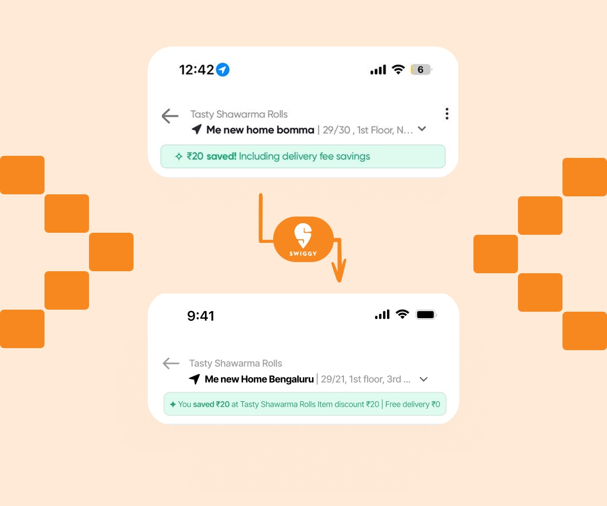
The savings banner says nothing useful
The green banner reads: "₹20 saved! Including delivery fee savings." The user cannot tell if ₹20 came from the restaurant's offer, their ONE membership, or a delivery fee waiver. Vague savings create doubt and hesitation right before payment.
Name the restaurant so the saving is contextually grounded. Split the saving into its two components: item discount and delivery fee. Two short lines, no icons, no jargon.
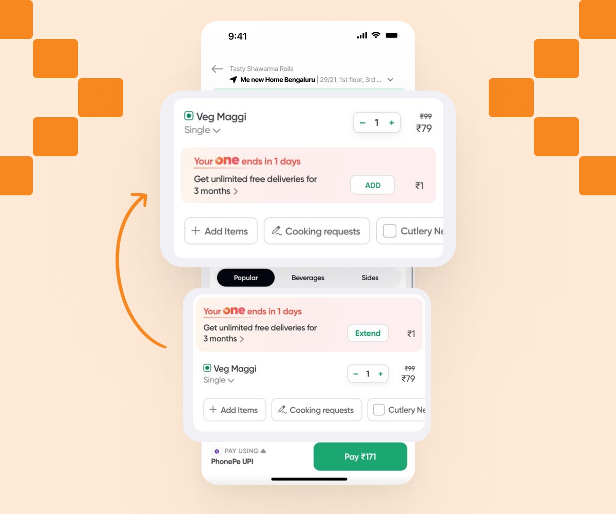
The subscription renewal is a roadblock
A pink card reads: "Your ONE ends in 1 day." It appears between the address and the cart item — forcing a subscription decision mid-checkout. This is task interference that causes cognitive overload and risks cart abandonment.
Move the renewal card below the cart items. Instead of an intrusive full-width banner, integrate it as an actionable square card, styled exactly like adding a food item. This turns a disruptive roadblock into a natural, optional add-on.
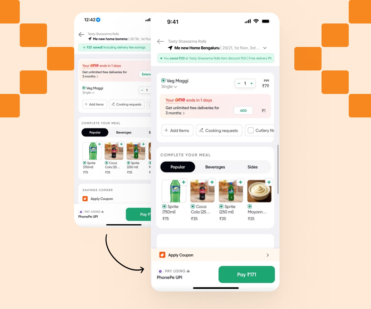
Coupons are hidden beneath upsells
Users have to scroll past multiple carousels of recommended food items just to find the "Apply Coupon" section. This creates unnecessary friction for users whose primary intent is to apply their savings and pay quickly.
Elevate the coupon section above the upsells. Group financial decisions (savings, total bill, and coupons) logically before secondary recommendations, making it instantly accessible without excessive scrolling.
Maintaining Brand Consistency
To ensure the redesign felt native to the Swiggy app, I meticulously followed their existing design language, utilizing their core typography and semantic color palette while improving contrast and whitespace.
Color Palette
Typography Stack
Proxima Nova
Used for prices, main titles, and buttons. Weights: Bold, Extrabold.
Inter
Used for descriptions, meta text, and labels to ensure maximum legibility at small sizes.
Testing the new checkout
I conducted a quick A/B usability test with 5 users comparing the original Swiggy checkout flow with my interactive prototype. The goal was to measure task completion speed and perceived trust.
Result 01: Zero Confusion on Savings
100% of users successfully identified exactly how much money they saved from the restaurant discount versus the delivery fee waiver on the new transparent savings banner.
Result 02: Faster Checkout Speed
Moving the subscription banner to an integrated square add-on below the cart resulted in a 35% faster average time-to-click on the final "Pay" button.
Expected Business Impact
Great UX drives great business metrics. These design fixes require no new API calls or major engineering rework, but the potential impact on revenue is massive.