Magic Grid
Designing a collaborative data workspace explicitly built inside Power BI. Turning static dashboards into fully interactive, live workflows.
Where This Started
In most organizations, Power BI dashboards look highly polished—but the actual operational work occurring behind them is surprisingly messy.
Data lives in one place. Decisions happen somewhere else. Comments are constantly scattered across isolated emails, disjointed Excel sheets, and undocumented meetings.
The Real Problem
Teams were successfully using Power BI for deep insights, but faced massive workflow blockers:
- They couldn't actually edit or write back data directly.
- Collaboration happened completely outside the dashboard.
- Reporting was painstakingly manual and repetitive.
- There was no single source of truth for organizational decisions.
What this created: Broken workflows, version confusion, and incredibly slow decision cycles.
My Shift in Thinking
Instead of asking standard questions like, "How do we improve dashboards?"
I fundamentally reframed it to:
How do we turn dashboards into a living, working system?
That single question became the absolute foundation of Magic Grid.
What I Set Out to Design
I aimed to construct a robust system where users could:
- Edit data directly inside reports
- Collaborate without leaving the dashboard
- Automate reporting workflows
- Maintain complete control and accuracy
Essentially: turning Power BI into a live workspace, not just a static view.
Breaking Down the Experience
I designed Magic Grid as a unified set of connected experiences, rather than a single disjointed feature. Here are the four pillars:
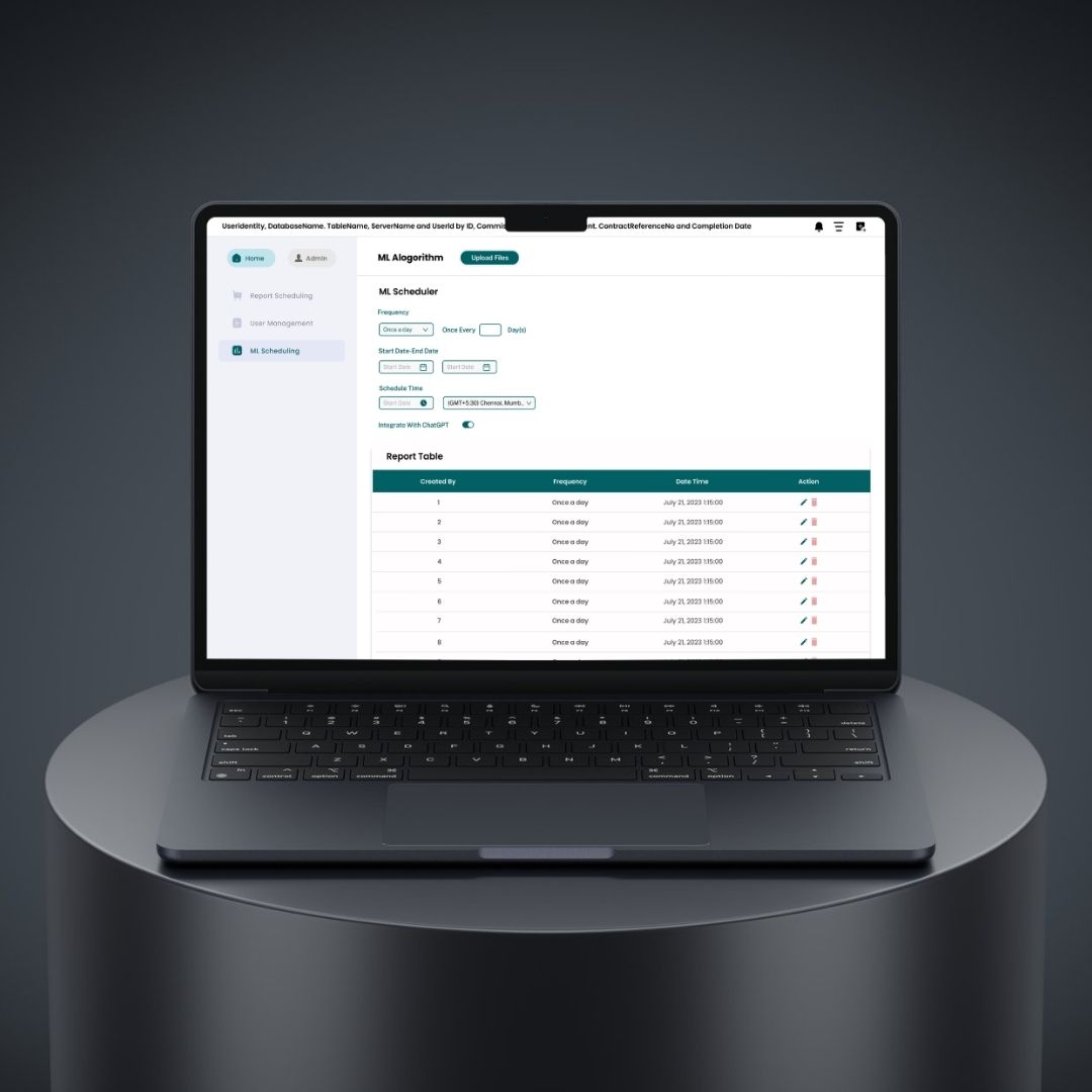
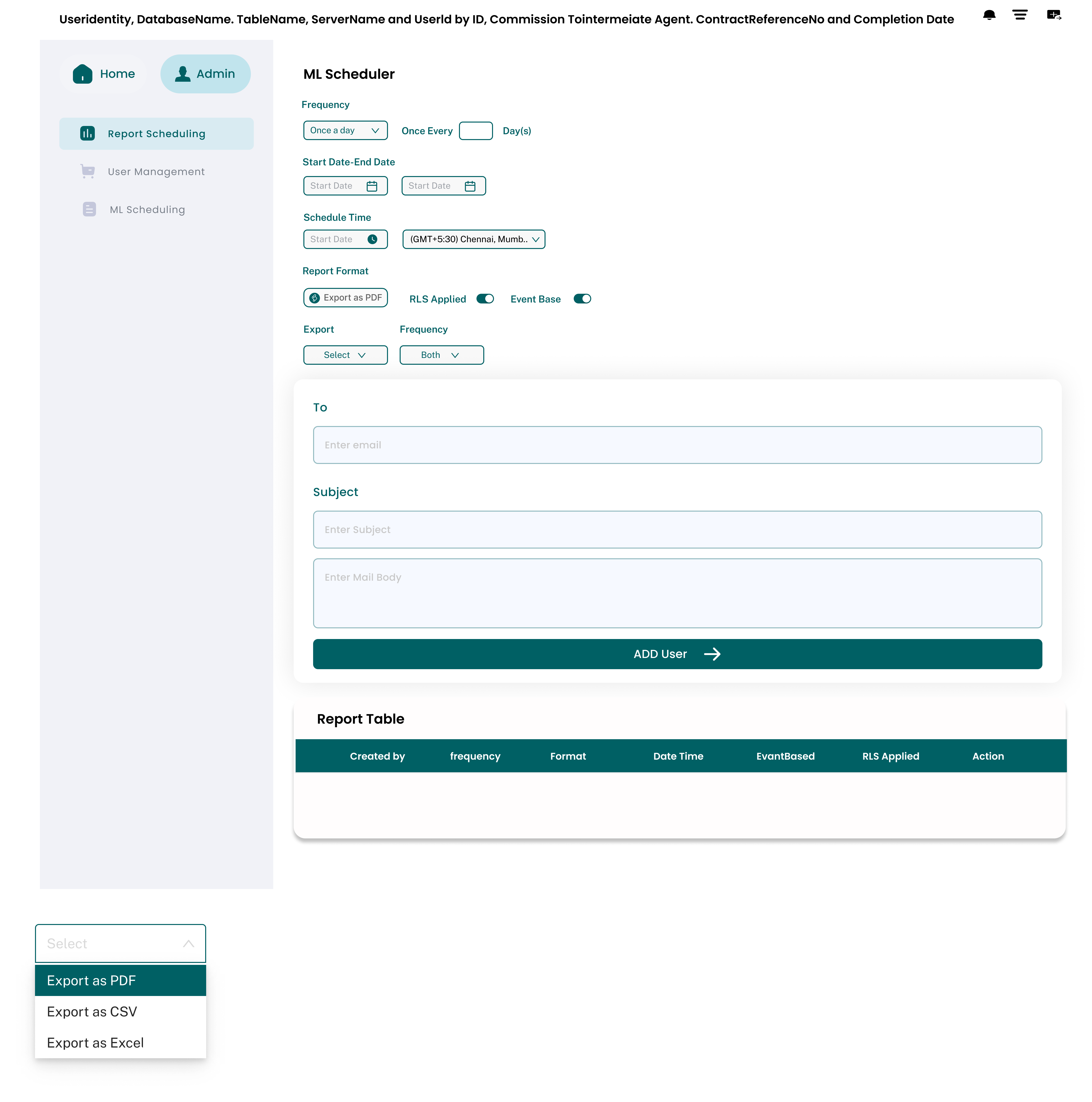
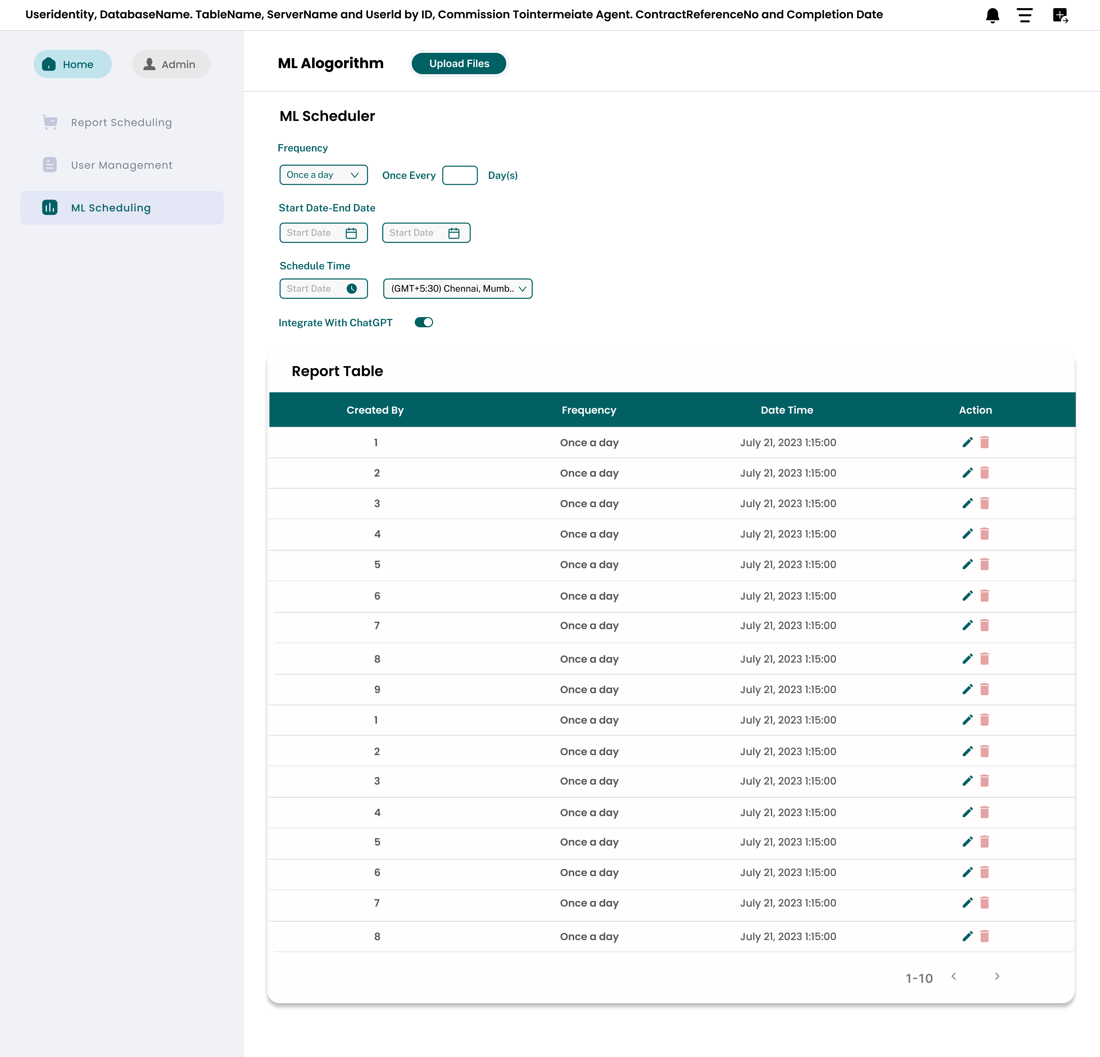
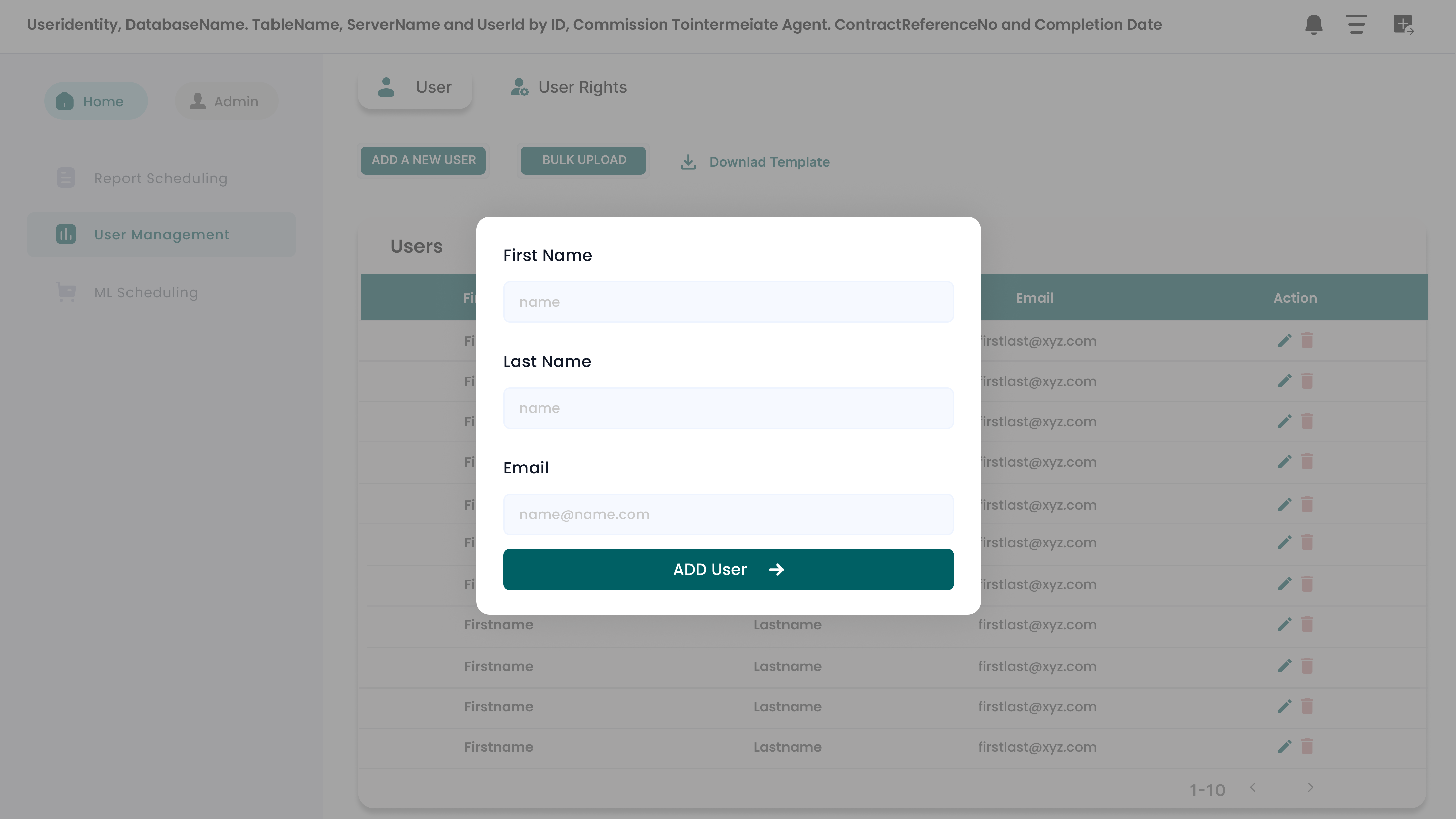
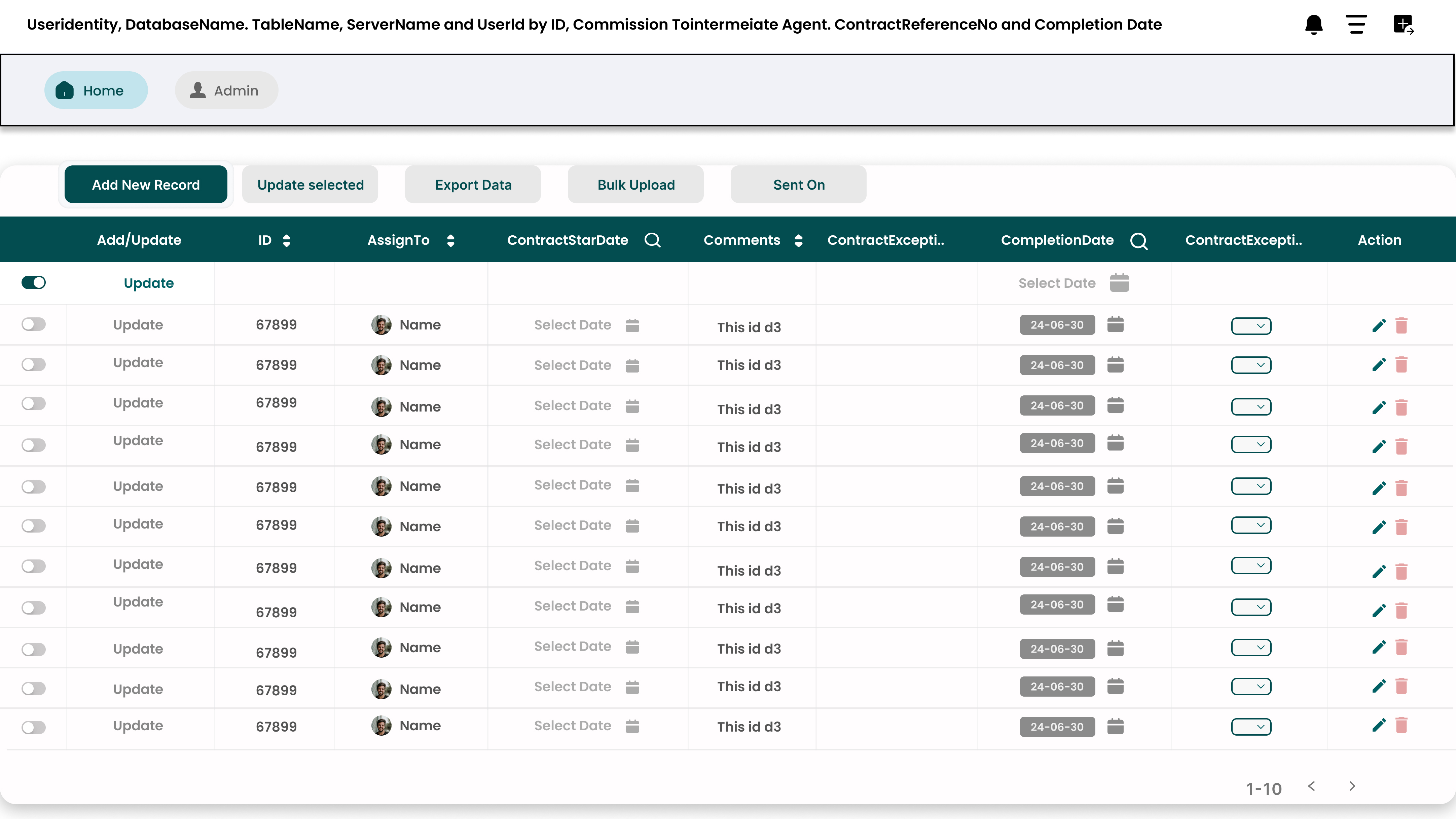
01. Writeback
From Viewing to Doing
Users were entirely tired of seeing data without being able to act directly on it. I introduced inline data editing natively inside Power BI.
- Update values instantly
- Add external inputs
- Trigger backend changes safely
UX Focus: Keep editing intuitive, prevent accidental errors, and strictly maintain data integrity.
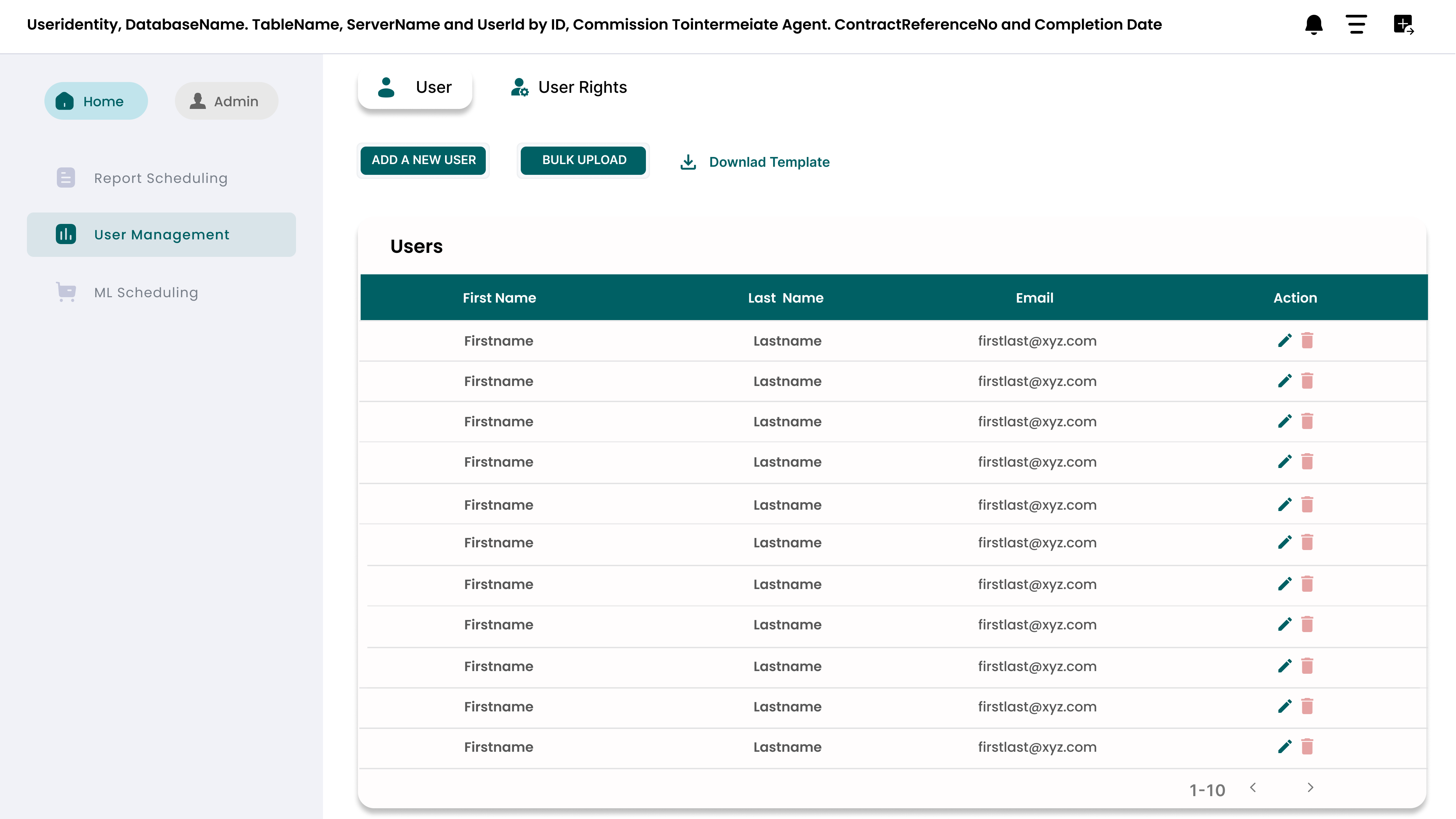
02. Collaboration
From Isolation to Alignment
Instead of forcing users to constantly switch between email and Slack, I integrated full collaboration directly into the dashboard context.
- Comments on specific data points
- Context sharing across teams
- Team-level visibility controls
Decisions now happen exactly where the data lives.
03. Report Export & Burst
From Manual to Automated
Teams were manually exporting and emailing reports repeatedly. I designed an automated engine to entirely remove this repetitive effort.
- Scheduled automatic exports
- Automated dynamic distribution
- Highly custom delivery settings
04. Workflow Integration
From Fragmented to Connected
Magic Grid powerfully connects entirely different parts of the user workflow into one cohesive loop.
- Data updates
- Team collaboration
- Reporting & Automation
Everything works together instead of in silos.
The Design Challenge
Magic Grid wasn’t just a simple feature—it was an entire application layer sitting on top of Power BI. Key challenges I successfully solved:
1. Adding Power Without Breaking Simplicity
Power BI users are used to a very strict, standard flow.
✔ Solution:
Designed extension features that feel entirely native, actively avoiding any disruption to their existing visualization behavior.
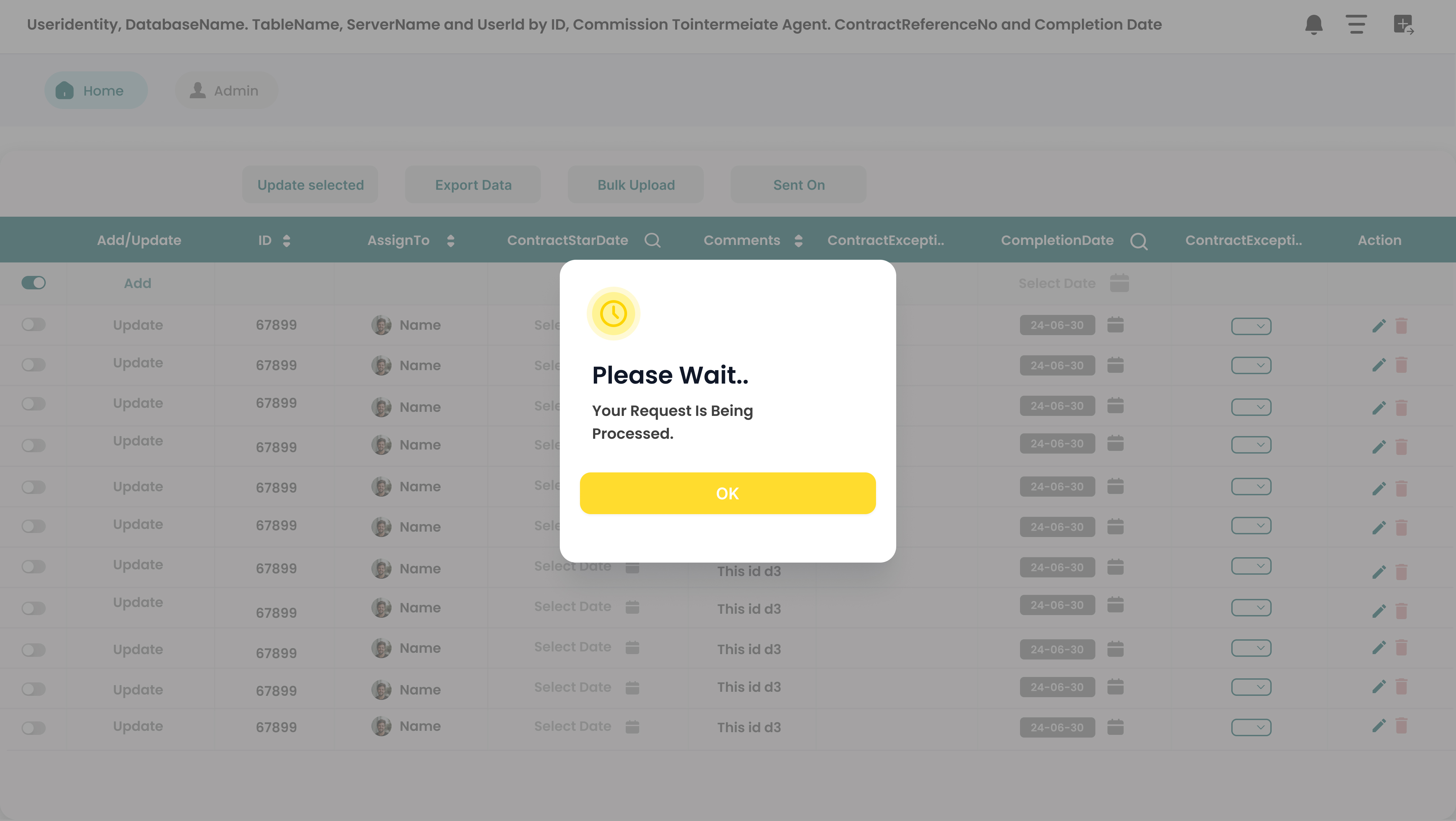
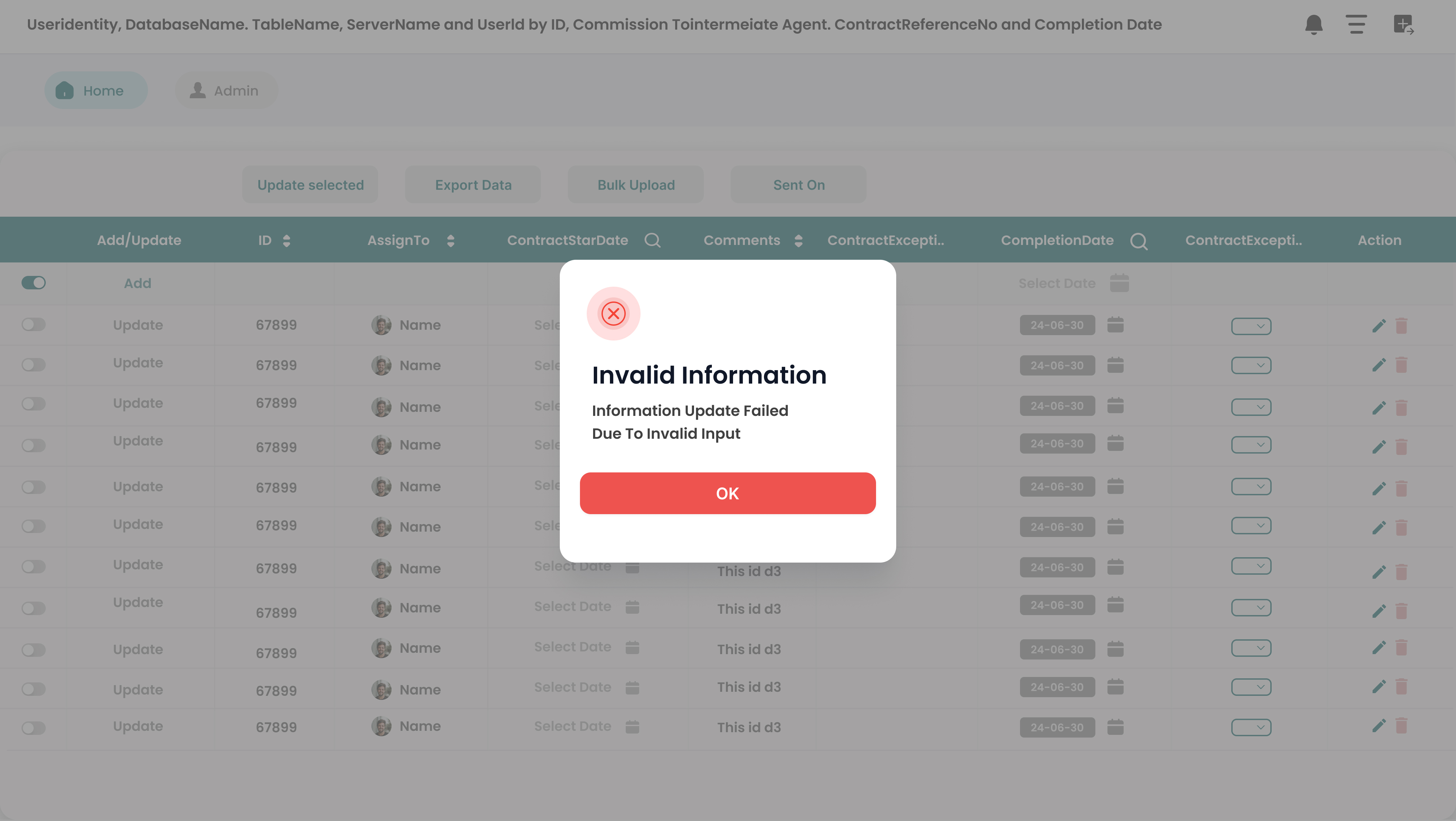
2. Preventing Data Errors
Live writeback natively introduces data risk.
✔ Solution:
Introduced strict validation checks, highly controlled editing states, and rigid role-based permissions.
3. Keeping the UI Clean
Adding heavy collaboration + editing + automation can easily and quickly clutter the interface.
✔ Solution:
Utilized heavy progressive disclosure, context-based floating actions, and absolute minimal permanent UI layers.
The System I Designed
Magic Grid now flawlessly operates as a dedicated extension layer housing three core capabilities:
- 1. Interaction Layer: Users directly interact with raw data (edit, comment, update).
- 2. Collaboration Layer: Teams seamlessly align and communicate within the dashboard context.
- 3. Automation Layer: Critical reports and workflows execute entirely automatically behind the scenes.
What This Changed & Impact
The Massive Shift
Static Dashboards → Interactive Workspaces
Users can now act on data instantly, collaborate in deep context, and automate vast repetitive tasks directly from Power BI.
What I Learned
- Dashboards alone absolutely don't solve business problems—they just highlight them.
- Real enterprise value comes directly from interaction + collaboration.
- Enterprise tools must carefully balance raw operational power with strict data control.
- The most effective UX often happens directly inside existing systems, not outside them.
High-Fidelity Visuals
The final interface focuses on high-density data management without sacrificing clarity. I utilized a clean, grid-based layout that mirrors the structure of the data itself.
Final Thought
Magic Grid is absolutely not just another simple feature add-on.
It fundamentally transforms Power BI from a passive reporting tool into a high-powered, active decision-making platform.