The PDF Bee
Designing a remarkably simple, secure, and lightning-fast workspace for managing PDF documents, prioritizing zero-friction user journeys over complex onboarding.
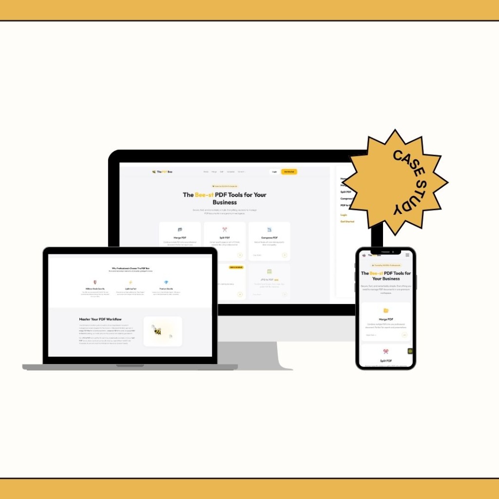
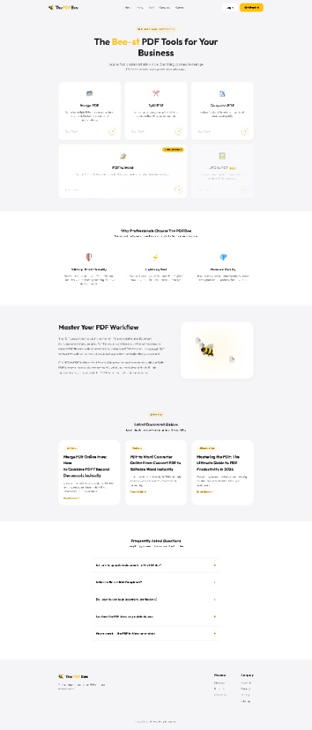
The PDF Bee is a comprehensive document management system designed for the modern professional. It provides essential tools to merge, split, compress, and convert PDF documents in one premium workspace.
My role was to design the end-to-end user experience, prioritizing industrial-grade performance masked behind a sleek, intuitive, and completely account-free interface.
Problem Space
The web is flooded with PDF converters. However, during early generative research, we uncovered severe user frustration with existing solutions:
The core challenge: How do we build a utility tool that feels like a premium SaaS product—respecting the user's time and security—while handling complex document manipulation without barriers?
Competitor Analysis
I analyzed the top 5 PDF utility websites in the market to identify gaps.
Industry Standard (Competitors)
- Aggressive ad placements causing accidental clicks.
- Paywalls blocking users *after* they spend time processing files.
- Outdated UI that feels untrustworthy for sensitive files.
- Hidden file retention policies.
The PDF Bee Approach
- Clean, ad-free interface focusing entirely on the task.
- Transparent pricing and limits upfront.
- Premium dark/light mode UI establishing immediate trust.
- Prominent military-grade security and auto-deletion copy.
User Definition
We designed for three distinct user types who require different levels of interaction:
1. The Student
Compressing large assignments to fit email size limits.
Goal: Speed and simplicity.
2. The Administrator
Merging multiple vendor invoices into a single report.
Goal: Precision reordering.
3. The Executive
Converting contracts from PDF to Word to make quick edits.
Goal: High formatting accuracy.
Product Goals
Business Goals
- Achieve high retention through a superior, frustration-free experience.
- Convert 5% of free users to Premium via high-volume file limits.
- Establish a strong brand presence in a generic market.
UX Goals
- Reduce the "time-to-first-conversion" to under 10 seconds.
- Require zero account creation for basic flows.
- Communicate security actively to build trust.
Information Architecture & User Flow
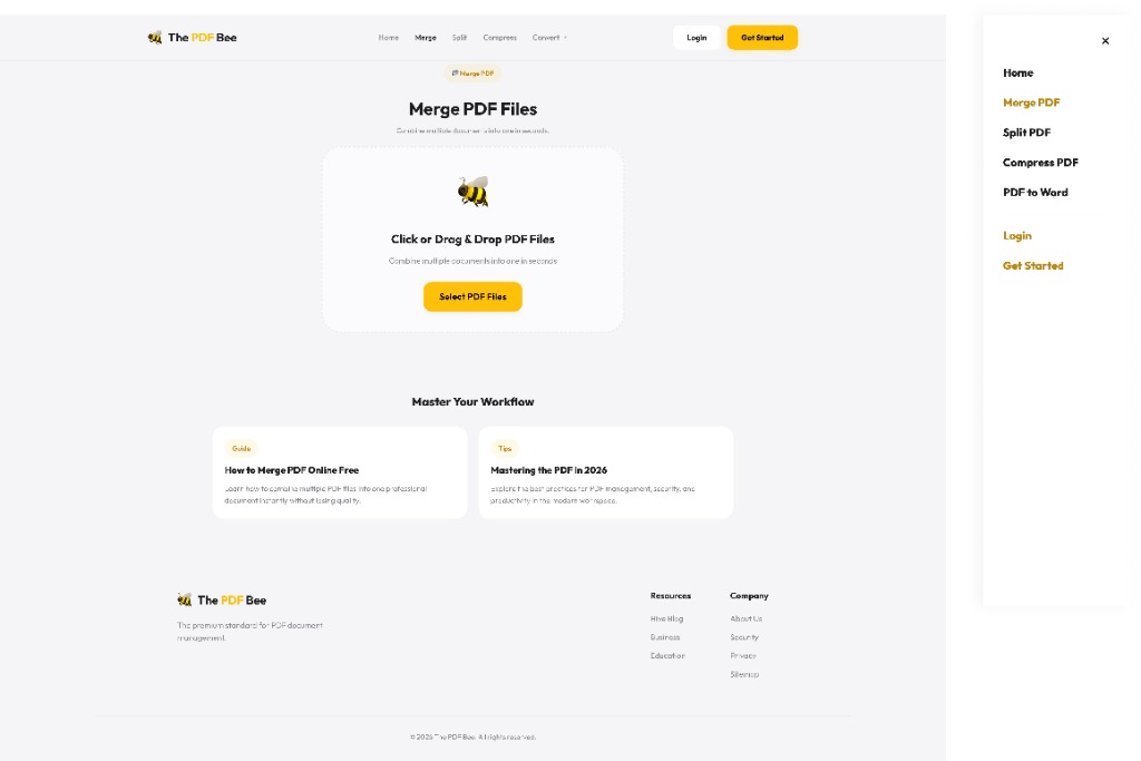
The architecture was stripped down to an absolute minimum. We removed the traditional SaaS dashboard entirely.
The "Zero-Friction" Flow:
Notice what is missing? No login screen. No tool selection intermediary page. If a user visits the "Merge" URL, the drop zone is immediately active and the entire page is the application.
UI Design System
To stand out from competitors, I designed a UI that feels premium and trustworthy.
Drop Zones
Massive, full-screen responsive drop zones with subtle dashed borders and micro-animations to guide user focus.
Typography
Using Inter for high legibility on data-dense elements and Space Mono for technical security labels.
Feedback States
Custom skeleton loaders and progress bars (the "Bee-Engine") to make wait times feel faster.
Color Palette
A deep slate dark mode offset by a vibrant signature yellow (#EAB308), establishing the "Bee" brand identity.
Designing Trust (Security UX)
Because users upload sensitive documents (tax forms, legal contracts), security couldn't just be a footnote in the privacy policy. It had to be a UX feature.
Implementation:
- Placed a "256-bit SSL Encrypted" badge directly below the primary upload button.
- Added a dynamic countdown timer on the download page showing exactly when the file will be permanently deleted from our servers.
- Used padlock iconography consistently during the loading and processing states.
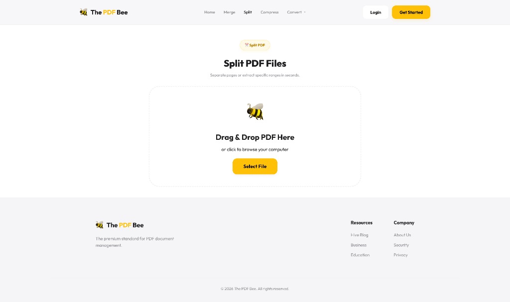
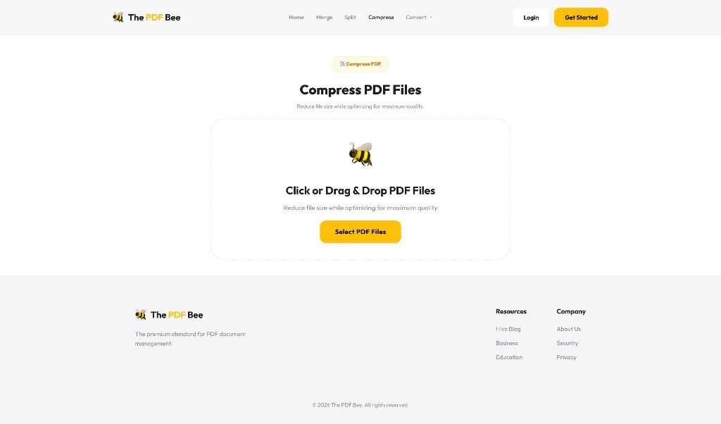
Tool-Specific Interactions
Each tool required a specific interaction model to be intuitive without a tutorial.
Merge & Split
I designed a visual timeline layout. Users can drag and drop file thumbnails to reorder them, or click a "scissor" icon between pages to split them. It transforms abstract file joining into a physical, visual manipulation.
Compress
Instead of confusing technical terms like "DPI" or "Bitrate," I used a simple semantic slider: High Quality → Good Quality → Smallest File Size. The system estimates the final file size in real-time as the slider moves.
Iteration & Refinement
Early usability testing revealed a friction point in the "PDF to Word" flow.
The Issue
Users were confused by OCR language selection prompts. Many just wanted to click "Convert" and leave, but the prompt halted their momentum.
The Fix
I removed the prompt entirely and implemented an auto-detect language mechanism on the backend. The UI became a single click. Advanced settings were tucked away under a "More Options" toggle.
Final Outcome
The PDF Bee represents a shift in utility SaaS:
- Lightning Fast: Users complete tasks in seconds without ad interruptions.
- High Trust: Overt security UX elements increased user willingness to upload sensitive business documents.
- Premium Feel: Proves that even simple utility websites deserve high-end, responsive, and beautiful design.
Key Learnings
- Removing barriers is a feature. Allowing users to test the product without signing up builds far more goodwill than forced onboarding.
- Security is a UX pillar. When dealing with user data, communicating safety visually is just as important as the backend implementation.
- Simplicity scales. By hiding complex OCR and compression settings behind simple, semantic sliders, the tool became usable for executives and students alike.