Pulse QA
Making data QA fast, visible, and reliable with AI. Ensuring quality at every step, instead of just checking data at the end.

The Context
In most companies, data quality is implicitly trusted… until something critically breaks. Reports go live with glaring errors. Numbers simply don't match. Consequently, business teams lose confidence in their analytics.
And the worst part? QA usually happens at the very end of the pipeline, when fixing issues is expensive, stressful, and highly disruptive to ongoing operations.
When I started working on Pulse QA, there was no defined user experience—only a clear, pressing business need:
The Problem I Took On
I quickly realized this wasn't just a simple tooling problem—it was a foundational workflow problem.
What was happening:
- QA was manual, tedious, and highly repetitive.
- Errors were discovered entirely too late in the lifecycle.
- Debugging required jumping across multiple fragmented tools.
- There was no clear visibility into what went wrong or why.
The Real Issue
QA lacked speed, clarity, and structure. It was a bottleneck disguised as a safety net.
My Approach
Instead of designing just another technical QA tool for engineers, I completely reframed the problem:
From there, I focused the entire product experience on three core principles:
Principle 01
Make issues instantly visible
No digging through logs. Red means broken, green means good.
Principle 02
Give full context behind errors
An error without the "why" is useless. Context is king.
Principle 03
Reduce effort to fix problems
Provide immediate, actionable remediation steps.
Understanding the Users
I designed Pulse QA to accommodate three core user types:
Data Analysts
Focused on validating dashboards and datasets before presenting to leadership.
QA Engineers
Focused on running structured, automated checks across the data pipeline.
BI Teams
Focused on ensuring final reports are mathematically reliable before public release.
Despite different roles, they all needed one specific thing:
Absolute confidence in their data.
Rethinking the QA Workflow
The traditional QA process was slow, fragmented, and purely reactive. I redesigned the architecture to shift from one-time QA to continuous QA.
The Traditional Process:
The New Continuous Pulse QA Flow:
Designing the Experience
1. From Logs to Clarity
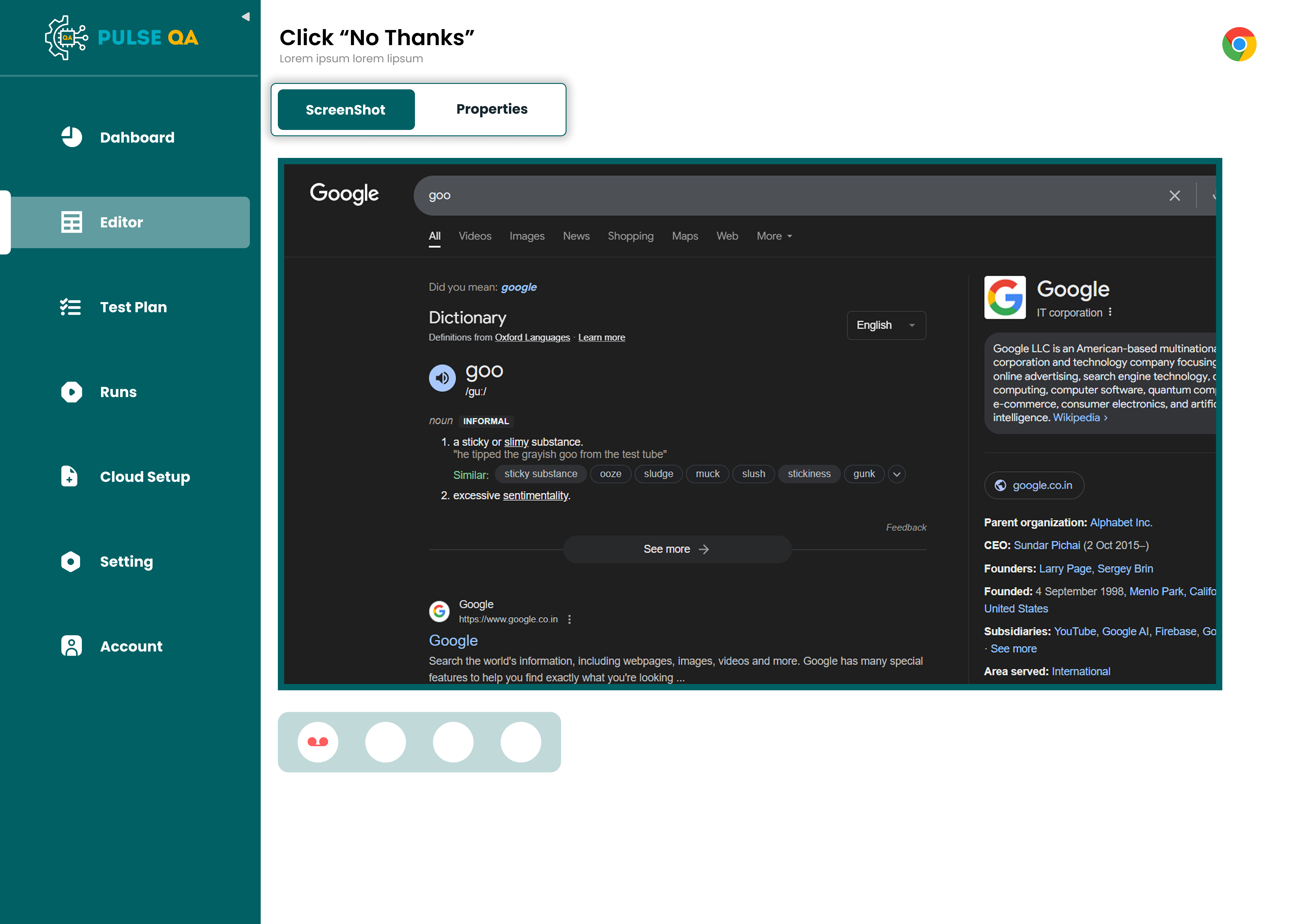
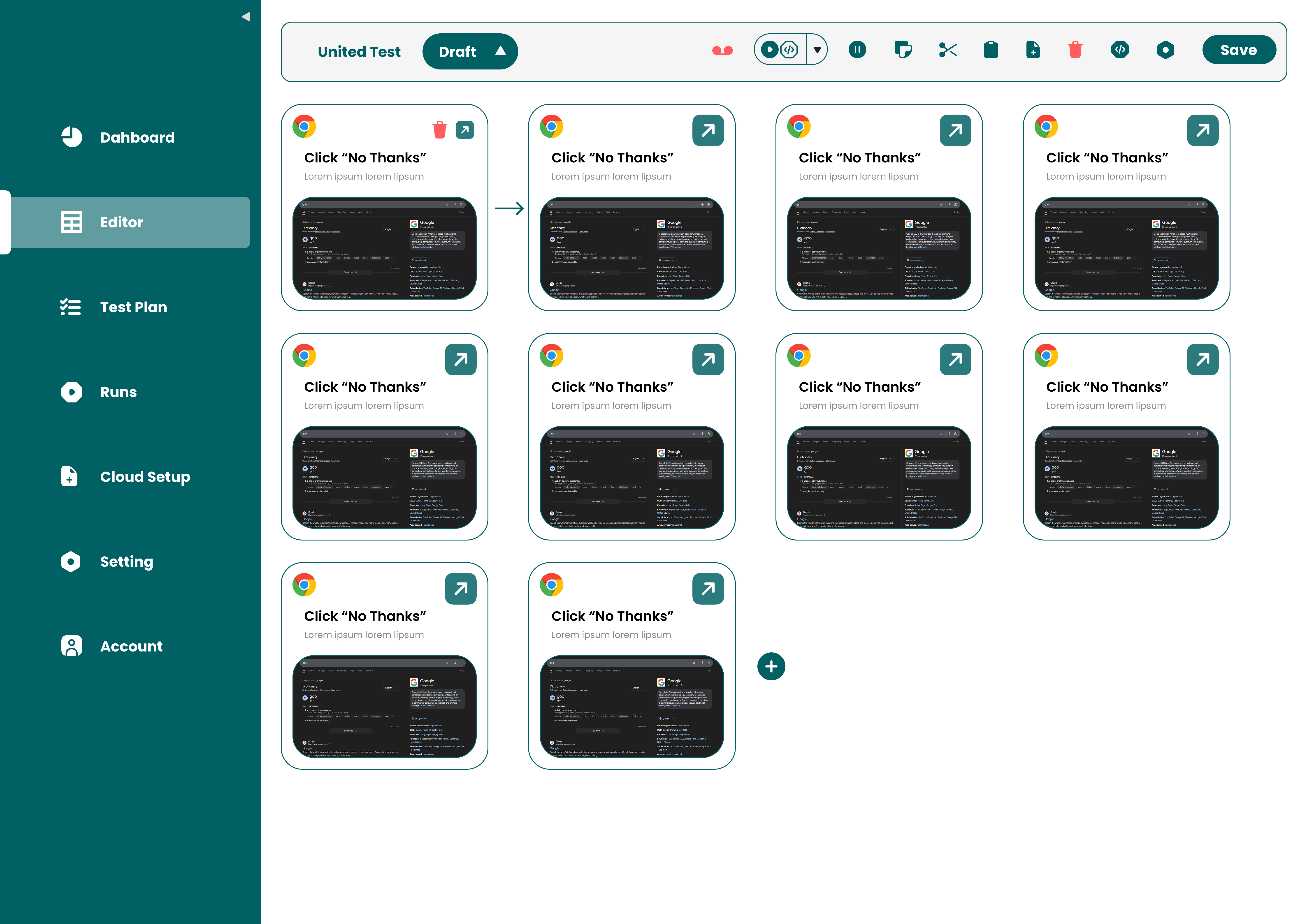
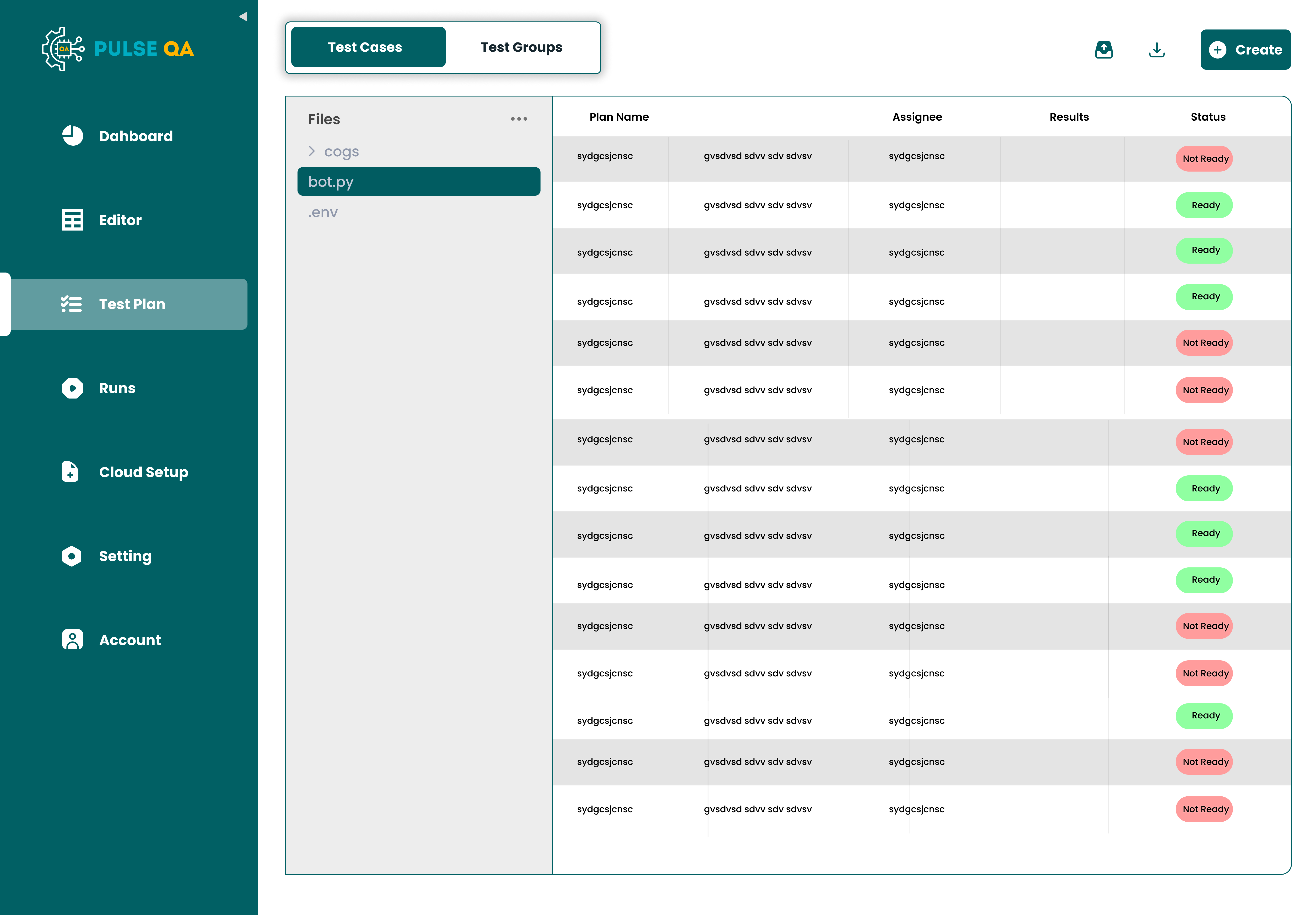
Most QA tools rely entirely on overwhelming text logs and dense database tables. I completely replaced that with a visual, error-first dashboard.
- Clear pass/fail health indicators.
- Highlighted critical issues instantly.
- Immediate visibility of overall system health.
2. Making Errors Actionable
An error without context is useless. I designed a deep drill-down experience where users can clearly see the expected vs actual values, the source of the issue, and the probable cause. This reduced debugging time exponentially.
3. Simplifying Rule Creation
Creating QA rules is usually a highly technical and tedious process. I introduced a guided rule builder and AI-assisted suggestions, allowing non-technical users to define robust validations with zero code.
4. Integrating AI Thoughtfully
AI wasn't just a flashy feature—it was a core workflow accelerator. It automatically detected anomalies and suggested fixes. However, to build trust, I ensured the UI always explicitly explained why something was flagged, leaving ultimate control with the user.
Ideation & Sketches
Before moving to pixels, I mapped out the core logic on paper. I focused on how to visualize complex data quality states without overwhelming the user.
↑ Early stage conceptual framework and logic mapping
High-Fidelity Visuals
The final interface utilizes a clean, data-rich aesthetic that prioritizes visibility and action.
Challenges I Faced
1. Too Much Technical Complexity
Early designs were overwhelming and dense.
Solution
I simplified the language, stripped out unnecessary jargon, and drastically reduced visual noise.
2. Poor Error Readability
System errors were hard to understand for analysts.
Solution
I utilized GenAI to rewrite raw system exceptions into plain, human-readable formatting.
3. Information Overload
Too many concurrent issues created immediate panic.
Solution
I introduced severity levels, grouped related errors into 'incidents', and added robust filtering.
Final Experience & Impact
Pulse QA successfully evolved into a proactive system where users can instantly see what's broken, inherently understand why it broke, continuously validate data, and fix issues incredibly fast.
The Impact
- Drastically reduced QA time across all teams.
- Massively improved mathematical accuracy in reports.
- Restored organizational trust in data systems.
Teams could finally move faster without second-guessing their own data.
What I Learned
- QA tools should prioritize absolute clarity over exhaustive completeness.
- Errors must always come packed with actionable context.
- AI should assist and accelerate, not replace user control.
- Simplicity is absolutely critical in inherently complex workflows.
Closing Thought
Designing Pulse QA was about fundamentally changing how teams think about quality.
It was the transition from "checking data at the end" to "ensuring quality at every single step."